A Claude dashboard is a dashboard Claude builds from a plain-language question about your data. Anthropic launched Claude Dashboards in beta on 8 October 2026, on the Pro, Max, Team and Enterprise plans. You connect a data warehouse such as BigQuery or Snowflake, or an app such as Salesforce, and ask a question. Claude writes a SQL query for each chart, runs it, and shows you the query next to the chart.
That last part matters. A chart you cannot check is a chart you cannot take into a meeting. Below: what a Claude dashboard is (and isn't), which plans get it, the build steps, four copy-paste prompts, the number check and the sharing rules. Plus the part Anthropic's guide leaves out: in our own test, a plain CSV upload was enough to get a Claude dashboard, no data warehouse required.
The Key Takeaways
- What it is: a saved artifact built from Claude's Dashboards template. Every chart shows its SQL query and when its data was last refreshed.
- Who gets it: Pro ($20 a month), Max, Team and Enterprise, in beta since 8 October 2026. Not Free. Enterprise owners have to switch it on.
- What it reads: Amazon Redshift, BigQuery, ClickHouse, Databricks and Snowflake, plus apps you've connected to Claude, such as Salesforce. In our test, an uploaded CSV worked too, as a fixed snapshot.
- Sharing: dashboards start private. Pro and Max can share by link or invite people by email, but every viewer needs a Claude account.
- On Free: no Dashboards template, but you can upload a CSV in a chat and Claude draws an interactive chart from it.
What Is a Claude Dashboard?
A Claude dashboard is an artifact made from the Dashboards template, a beta feature Anthropic added to Claude on 8 October 2026. In Anthropic's words, Claude Dashboards "turn questions about your company's data into dashboards." You connect the data and ask in plain language. Claude writes the queries and builds the charts.
Three details set a Claude dashboard apart from a chart in a normal answer. First, Claude writes a SQL query for each chart and runs it against your data source, and you can click any number to see the query behind it. Second, each chart shows when its data was last refreshed. Third, the dashboard is saved in the Artifacts tab in the Claude sidebar, so you can open it again from any conversation.
Anthropic positions Claude Dashboards for quick, exploratory questions. Its help center's example is "how this week's signups compare with last month's." When a question needs deeper analysis, you send the dashboard to a BI tool and continue there.
Four Things People Call a Claude Dashboard
People who search for a Claude dashboard mean one of four different things, and most confusion about the feature comes from mixing them up. Claude Dashboards is the new one. The other three are older or unrelated.
| What people mean | What it is | Plans | Saved? |
|---|---|---|---|
| Claude Dashboards | The Dashboards template: charts built from SQL queries against connected data | Pro, Max, Team, Enterprise (beta) | Yes, in the Artifacts tab |
| Custom visuals | An interactive chart Claude draws inline in a chat, for example from an uploaded CSV | All plans, web and desktop (beta) | No, unless you save it as an artifact |
| Live artifacts | Artifacts made in Claude Cowork before 19 August 2026 | Legacy | Yes, but you can't edit them in place |
| Usage dashboard | Your plan usage on claude.ai, or the Usage and Cost pages in the Claude Console for the API | Not a plan feature | Not an artifact |
A lot of the advice that ranks for Claude dashboard searches was written about live artifacts, before the Dashboards template existed. Anthropic now treats them as legacy: "Artifacts made in Claude Cowork before August 19, 2026 are live artifacts. They keep working, but you can't edit them in place." Older guides say Claude dashboards are desktop-only and that Pro and Max can't share them. Those guides describe live artifacts, not Claude Dashboards.
Which Claude Plans Include Dashboards?
Claude Dashboards is in beta on Pro, Max, Team and Enterprise. Anthropic's pricing page lists Pro at $20 a month billed monthly, with Claude Dashboards (beta) among its features. The Free plan doesn't get the Dashboards template. Here is the plan-by-plan picture from Anthropic's artifacts and sharing help pages.
| Feature | Free | Pro | Max | Team | Enterprise |
|---|---|---|---|---|---|
| Dashboards template (beta) | No | Yes | Yes | Yes | Off until an owner turns it on |
| Connect your apps to an artifact | No | Yes | Yes | Yes | Yes |
| Custom visuals in chat | Yes | Yes | Yes | Yes | Yes |
| Share with anyone who has the link | No | Yes | Yes | If an owner allows | If an owner allows |
| Invite people by email (beta) | No | Yes | Yes | Yes | Yes |
Building and changing a dashboard counts toward your plan's usage limits, the same as the rest of your work in Claude. If you hit limits often, our guide to how Claude usage limits work explains the five-hour and weekly windows. For what each plan costs, see Claude pricing.
On Team and Enterprise, owners control the feature in Organization settings > Artifacts. On Enterprise it is off by default, and owners can limit it to specific groups with custom roles.
How to Build a Claude Dashboard, Step by Step
To build a Claude dashboard, connect a data source, ask for a dashboard in a chat or from the Artifacts tab, then check each chart's query. Use Claude on the web or Claude Desktop.
Before You Start
Claude needs two things in place before it builds any artifact, dashboards included. First, Cloud code execution and file creation has to be on, which Free, Pro and Max users switch on in Settings > Capabilities and Team and Enterprise owners set in Organization settings. Second, Claude needs the data. Anthropic's Dashboards guide says to connect the data you want to ask about before you create the dashboard; for a fixed snapshot, an attached CSV is enough.
The Steps
- Connect your data. Add your data platform (Amazon Redshift, BigQuery, ClickHouse, Databricks or Snowflake) or an app such as Salesforce in Claude's connector settings. For a one-off snapshot, attaching a CSV to the chat also worked in our test.
- Start the dashboard. In any chat, ask for one, or select Output in the message box and choose Dashboards. You can also open the Artifacts tab, pick a Dashboards template and describe what you want.
- Ask a question, not for a chart. Name the table or app the data lives in, the time window and what you want to compare.
- Approve the connection. The first time an artifact uses a connected app, Claude shows which apps and tools it will use and asks you to approve them.
- Check the queries. Click a number to open the query behind it. If it isn't counting what you meant, tell Claude what to change.
- Refine in the chat. Ask for changes such as "Add a filter for region" or "Change this to a weekly view."
- Find it again. The dashboard is saved in the Artifacts tab in your sidebar.
Claude announced the feature on its official account on launch day, with the same three-part pitch: connect, ask, check the query.
With Claude Dashboards, connect a data platform or CRM tool and ask a question in plain language. Claude writes the query and builds a dashboard that updates as your data changes, and every chart shows that query.
— Claude (@claudeai) October 8, 2026
In beta on paid plans.
What Can a Claude Dashboard Connect To?
A Claude dashboard officially connects to two kinds of source: a data warehouse, or another app you've connected to Claude. In our test it also worked from an uploaded CSV. Anthropic's help center lists Amazon Redshift, BigQuery, ClickHouse, Databricks and Snowflake as warehouses. Its example app is Salesforce: "Make a dashboard of my open Salesforce opportunities by stage and owner."
When a question outgrows the dashboard, Claude can send it to a BI or analytics tool. At launch Anthropic named Amplitude, Grafana, Hex, Mixpanel, Omni, Perplexity, PostHog and Sigma, with Looker, monday.com and Tableau "coming soon."
No Data Warehouse? Upload a CSV
Without a data warehouse, you can still build a Claude dashboard by uploading a CSV file to the chat. Anthropic's help center doesn't list file uploads as a dashboard source, so we tested it. For the Fello AI dashboard test, we made up a CSV of 60 orders dated 1 September to 15 October 2026, uploaded it to Claude on a paid plan on 15 October 2026, and asked for a dashboard. Every name, number and figure in the test file and the screenshots below is fictional, created only for this test.
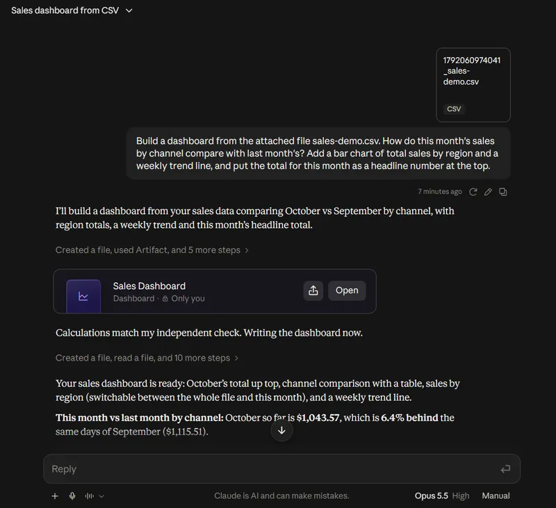
Claude built a real dashboard artifact, labelled Dashboard and visible only to us, with a headline total, a channel comparison table, a region chart and a weekly trend line. Before it finished, it reported "Calculations match my independent check." Two catches came with it, both stated by Claude in its reply. The dashboard runs from a fixed file, so it won't update when your data changes; Claude offered to look for a connector "so the numbers update live instead of from a fixed file." And "The uploaded CSV is visible to anyone you share the dashboard with."
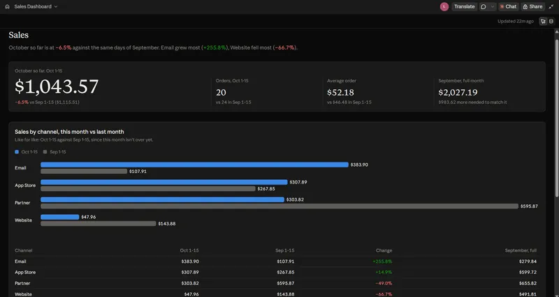
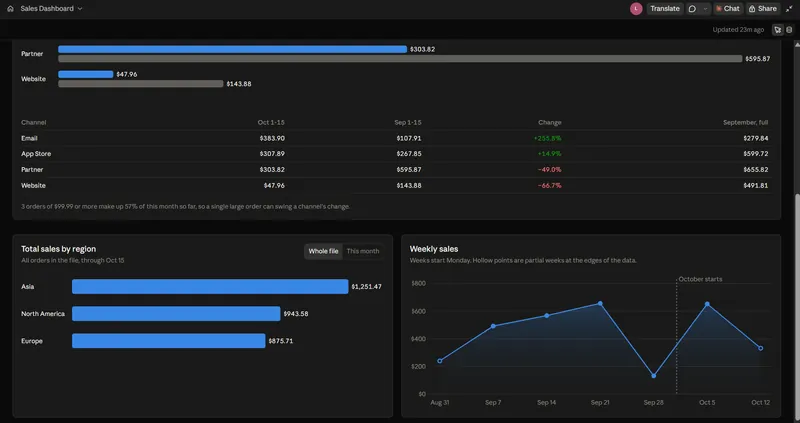
Opened full screen, the dashboard looked like a finished report. It had a headline tile for the first half of October and tiles for orders, average order and September's full total. Below them sat paired bars by channel, a region chart with a whole-file or this-month switch, and a weekly line that marks partial weeks as hollow points. The header read Updated 22m ago.
So a solo user has three routes, depending on whether the numbers need to stay current.
| Route | What you get | Plans |
|---|---|---|
| Upload a CSV and ask for a dashboard | A saved Claude dashboard built from a fixed copy of the file. Worked in the Fello AI dashboard test. It doesn't update when the source changes. | Paid plans (we tested on one) |
| Connect an app you already use | A Claude dashboard that reads current data. Artifacts can read from the apps you've connected to Claude, including custom connectors, so a CRM with a Claude connector is the cleanest source. | Pro, Max, Team, Enterprise |
| Upload the file and ask for a chart | An interactive custom visual in the chat, not a saved dashboard. Ask "What does the data show?" Copy it as an image, download it, or save it as an artifact to keep it. | All plans, web and desktop |
If what you need is the chart inside a spreadsheet you can hand to someone, our guide to using AI in Excel covers that route.
When You Want the File, Not the Dashboard
If you need a spreadsheet or a deck rather than a live dashboard, ask for the file itself. The goal is often the totals in a sheet, or the charts in Monday's deck. In Fello AI, you drop in the CSV and ask for the finished file. You get an Excel spreadsheet with working formulas, or a PowerPoint deck with the charts already on the slides. No connector, no warehouse.
Fello AI runs Claude, ChatGPT, Gemini and other models in one Mac, iPhone and iPad app. If Claude's reading of your numbers looks off, ask another model the same question in the same window. Fello AI doesn't build live dashboards that refresh from a warehouse. For that, use Claude Dashboards.
Copy-Paste Prompts for a Claude Dashboard
The best Claude dashboard prompts say what you want to know, not just what to chart. Anthropic's own example: a question like "How do this month's signups by channel compare with last month's?" beats asking for "a signups chart." If the data lives in a specific table or app, name it. Replace the brackets with your own details.
A weekly trend with a comparison:
Build a dashboard from [table or app]. How do weekly [signups / orders / sales] for the last 12 weeks compare with the same weeks last year? Split them by [channel / plan / region]. Put one headline number for the latest full week at the top.A pipeline view from a CRM:
Make a dashboard of my open [Salesforce] opportunities by stage and owner. Add the total value per stage, and a table of deals with no activity in the last 21 days.A dashboard with the definitions spelled out:
Build a dashboard from [table]. Revenue means [paid invoices only, by payment date]. Use [calendar] months. Exclude [test accounts]. Show monthly revenue for this year, and under each chart write one sentence saying exactly what it counts.A plain-English check of a chart:
Explain the query behind this chart for someone who doesn't write SQL. Which tables does it read? Does it join any, and could a join count a record twice? What date range and filters does it use? List every assumption you made that I didn't state.How to Check a Claude Dashboard Before You Trust It
Check a Claude dashboard by comparing one number with a figure you already trust, then reading the query behind each chart. A dashboard that looks finished still rests on Claude's guess about what your words mean. Revenue might mean booked, invoiced or paid revenue. This quarter might mean the calendar quarter or the fiscal one.
Claude Dashboards makes that check possible because every chart carries its query. Click a number, open the query, and confirm three things: which table it reads, which dates it covers and what it leaves out. If a total looks roughly double what you expected, a join is the usual suspect. If you can't read SQL, paste the last prompt from the prompt section and Claude explains its own query in plain English.
What the Fello AI Dashboard Test Caught
The Fello AI dashboard test caught two things a quick look would miss: a comparison Claude chose on its own, and a rounding error. We asked how "this month's sales by channel compare with last month's." Claude didn't compare all of September with half of October. It compared 1 to 15 October with 1 to 15 September, and said so under the heading "A choice I made that you didn't ask for." That was the sensible reading, but it was Claude's reading, not ours. It also warned that three large orders made up 57% of October so far, and flagged two oddities in the file (the made-up data, again).
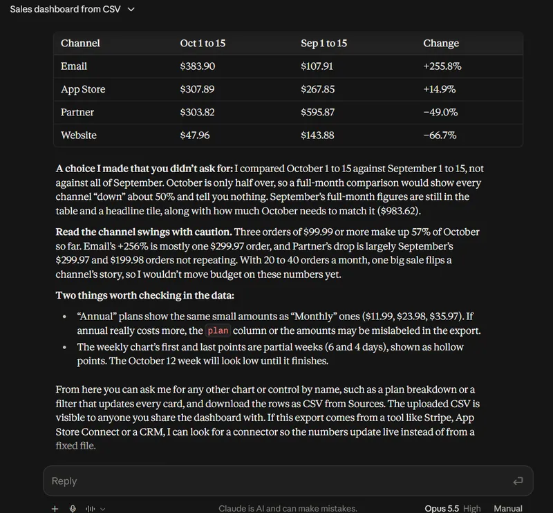
We then recounted the fictional file ourselves. Every total on the dashboard matched: $1,043.57 across 20 orders for 1 to 15 October, each channel, each region, September's $2,027.19 and all seven weekly points. The one slip was a rounding error. The headline tile says October is down 6.5%, Claude's chat reply says 6.4%, and the true figure is 6.45%, which rounds to 6.4%. It is a small error, but it is the kind that ends up in a slide, and only a recount catches it.
Do this check once, on the first version, before anyone else sees it. After that, changes you ask for in the chat build on a definition you have already confirmed.
How to Share a Claude Dashboard
To share a Claude dashboard, open it and click Share. Dashboards start private to you. Who else can open one depends on your plan.
| Plan | Who you can share a dashboard with |
|---|---|
| Pro and Max | Only you, or anyone with the link. You can also invite specific people by email (beta). |
| Team and Enterprise | People you invite, everyone in your organization, or anyone with the link. Link sharing outside the organization works only when an owner has turned on External sharing. |
Every viewer needs a Claude account. Anthropic's sharing page says people without one can't open a shared artifact, even with the link. Sharing settings also change only on the web or in Claude Desktop, not in Claude for iOS or Android.
What a Viewer Sees
A shared Claude dashboard doesn't hand your data connection to the viewer. Anthropic's artifacts page says "Everyone connects their own apps, even when using a shared or published artifact." Anthropic's sharing page adds a second limit. For people you invite from outside your organization, "parts of the artifact that use Claude or your connectors don't work for them." Before you send a dashboard link to a client, open it from a second account and see what loads.
Claude Dashboards sits in the same Artifacts family as Claude's other templates. If you have used Claude Docs or Claude Slides, the Share menu works the same way.
Claude Dashboard Limits to Know
Claude Dashboards is a beta built for quick questions, not a replacement for a governed BI tool. Six limits matter before you rely on a Claude dashboard.
| Limit | What it means for you |
|---|---|
| It is a beta | Anthropic labels the Dashboards template beta on every plan that has it. |
| A file is a snapshot | A dashboard built from an uploaded CSV stays as it was. Only a connected warehouse or app keeps the numbers current. |
| Shared means the file is shared | In our test Claude warned that the uploaded CSV is visible to anyone you share the dashboard with. |
| It uses your usage allowance | Building and refining a dashboard counts toward your plan's limits. |
| Definitions are Claude's unless you set them | Two people asking the same question in different words can get different queries. Write the definition into the prompt. |
| It is not on Free | Free users get custom visuals in chat, not the Dashboards template. |
For comparison, ChatGPT's answer to the same need works differently. ChatGPT's Intelligent UI puts charts and interactive elements inside an answer, while Claude Dashboards saves a separate artifact built on queries you can inspect.
Looking for Your Claude Usage Dashboard Instead?
If you searched for a Claude dashboard to see how much of Claude you've used, you want a usage page, not Claude Dashboards. For API usage, the Claude Console has a Usage page that breaks usage down by model and API key, and a Cost page for spending. For your chat plan, our guide to Claude usage limits explains where the limits come from and how the windows reset. Anthropic notes that claude.ai, Claude Code and Claude Desktop all count toward the same usage limit.
Is a Claude Dashboard Worth Building?
Yes, if your data already sits in a warehouse or a connected app and you want an answer today instead of a ticket to the data team. Claude Dashboards turns that question into charts in minutes, and the visible query means you can prove each number before you share it. That is more than most chat-based charting offers.
A spreadsheet on your desktop works too, with one condition: treat the result as a snapshot. In the Fello AI dashboard test, a CSV upload produced a real dashboard in one prompt, but it won't move when your numbers do, and sharing it shares the file. For a report that stays current, connect the source. Read Anthropic's own Claude Dashboards guide for the current source list before you start, because a beta's list grows, and for the BI tools you can send a dashboard to.
Frequently Asked Questions
Is Claude Dashboards free?
No. Claude Dashboards is in beta on the Pro, Max, Team and Enterprise plans only. Free users can still upload a CSV in a chat and get an interactive custom visual, but it doesn't save as a dashboard or update from a data source.
Do I need to know SQL to build a Claude dashboard?
No. Claude writes the SQL query for each chart. Knowing SQL helps you check the query, but you can also ask Claude to explain any query in plain English before you trust the number.
Can Claude build a dashboard from a CSV or Excel file?
Yes, from a CSV, in our test. We uploaded a fictional sales CSV on a paid Claude plan and got a saved dashboard in the Artifacts tab. It is built from a fixed copy of the file, so it doesn't update, and anyone you share it with can see the uploaded file. We didn't test an Excel file.
Can Claude build a Power BI dashboard?
Not as a Power BI file. Claude Dashboards builds its own dashboard artifact inside Claude. Power BI isn't on Anthropic's launch list of tools you can send a dashboard to, which names Amplitude, Grafana, Hex, Mixpanel, Omni, Perplexity, PostHog and Sigma, with Looker, monday.com and Tableau coming soon.
Can someone without Claude see my dashboard?
No. Anyone who opens a shared Claude artifact, a dashboard included, needs a Claude account, even with the link. People you invite from outside your organization also can't use the parts of the artifact that rely on your connectors.